
GPA Calculator to fill out or let AI do the work
GPA calculators already exist. But most of them look like spreadsheets built in 2009. This one is different: it allows manual + AI-powered transcript upload and gives you a straightforward result, wrapped in a clean UI based on Tailwind's UI system and designed to feel like an inviting product high school and college students would actually want to use
This was a commissioned product design for high school and college students worldwide who want to study in the U.S. and need help figuring out their GPA score, U.S. College requirements, and additional information about U.S. academics.
TIMELINE: 12 weeks
ROLE: UI DESIGNER
DELIVERABLES: HIGH FIDELITY MOCK-UPS OF ALL SCREENS IN DESKTOP BREAKPOINT
SOFTWARE: FIGMA
My role
UI Design: starting from a base UI kit and delivering all high-fidelity mockups in the Desktop breakpoint
UX patterns and principles: applied occasionally
QA: dependent on what the developer was building at the time
The Design Brief
This was a small-budget WebApp UI design for a solo-entrepreneur client with extensive knowledge in the educational field. His focus was a UI redesign, with clear design constraints:
Use a UI system of components already available the developer to implement easily
Make the UI attractive and look more modern than other competitors in the space
Create an AI conversational calculator, the differentiating feature of this product at the time
Stick to Desktop screens and a 1-column layout as much as possible, so it can be adjusted for mobile screens easily
No budget for additional responsiveness, so no mobile screens required, with very few exceptions
The Approach
With a live product and specific reference points, I jumped into high-fidelity mockups. I proposed incremental adjustments and improvements from known UI patterns and principles when possible.
I proposed using Flowbite's Figma components (based on Tailwind UI component library). This system looked current, clean, and minimal enough to fit the product perfectly. However, the calculators had to be customized to show all their features, and most components had to be detached and serve as a base instead.
The goal was for the UI to feel clean, current, and attractive enough for young high school and college students by adding color and personality to the product. Tailwind's color palette, sans serif fonts, and the added boldness of the Archivo font were the starting point for the visual direction.
The UI kit grew organically as the screens and flow started to stack. Every new section and commission meant adding more components into the system, so that by the end, everything that was used to build the product was incorporated into the Figma file.
Design Decisions and Scope
My focus was:
Having a consistent UI design and applying basic UI principles and patterns to remove visual clutter
Typographic contrast and a clear hierarchy using a determined typescale
Visual consistency with a uniform set of components
Accessibility considerations for color contrast and legibility, ensuring WCAG AA Levels minimum
29Desktop Screens | 4Calculator Types: | 2Page Templates |
|---|
Core Calculators
College calculator | High school calculator | GPA scale converter | Raise your GPA |
|---|---|---|---|
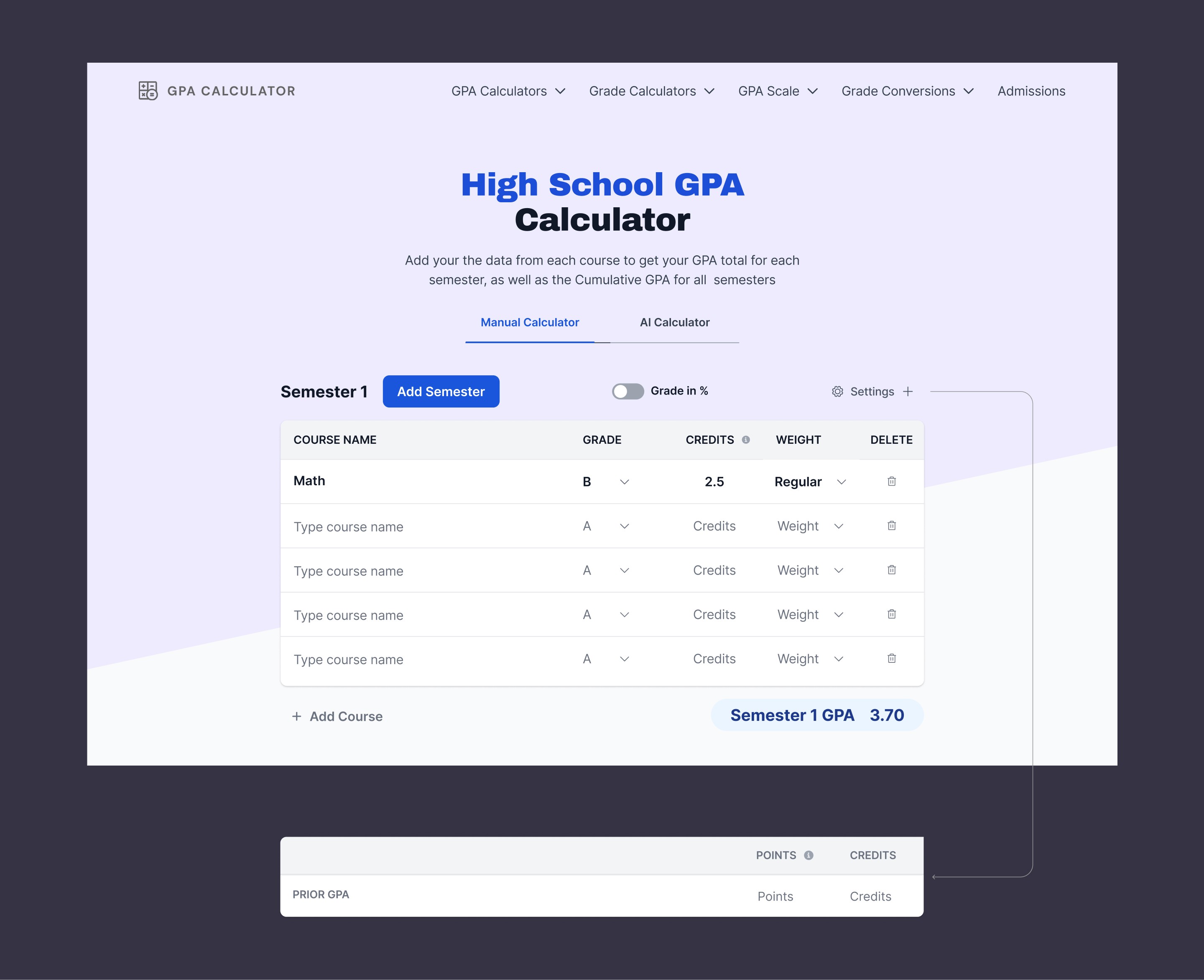
Light blue section, manual + AI upload flows | Purple section, mirrored structure | A calculator to translate a letter or number grade into a GPA score | A calculator to help you raise your GPA |
Discovery + search
GPA scale converter | Country Grade Converter | GPA search + filter |
|---|---|---|
Convert grades to GPA range + long-form detail page | Country-specific grading scale pages | Find college GPA requirements, 1-column filter system |
Handoff + system
Essential Developer handoff notes | UI Kit |
|---|---|
Tailwind code snippet links, when applicable | Type scale, color palette, buttons, badges, inputs, and cards |
I'll focus on the core calculators and the main entry point to explain my design thinking process.
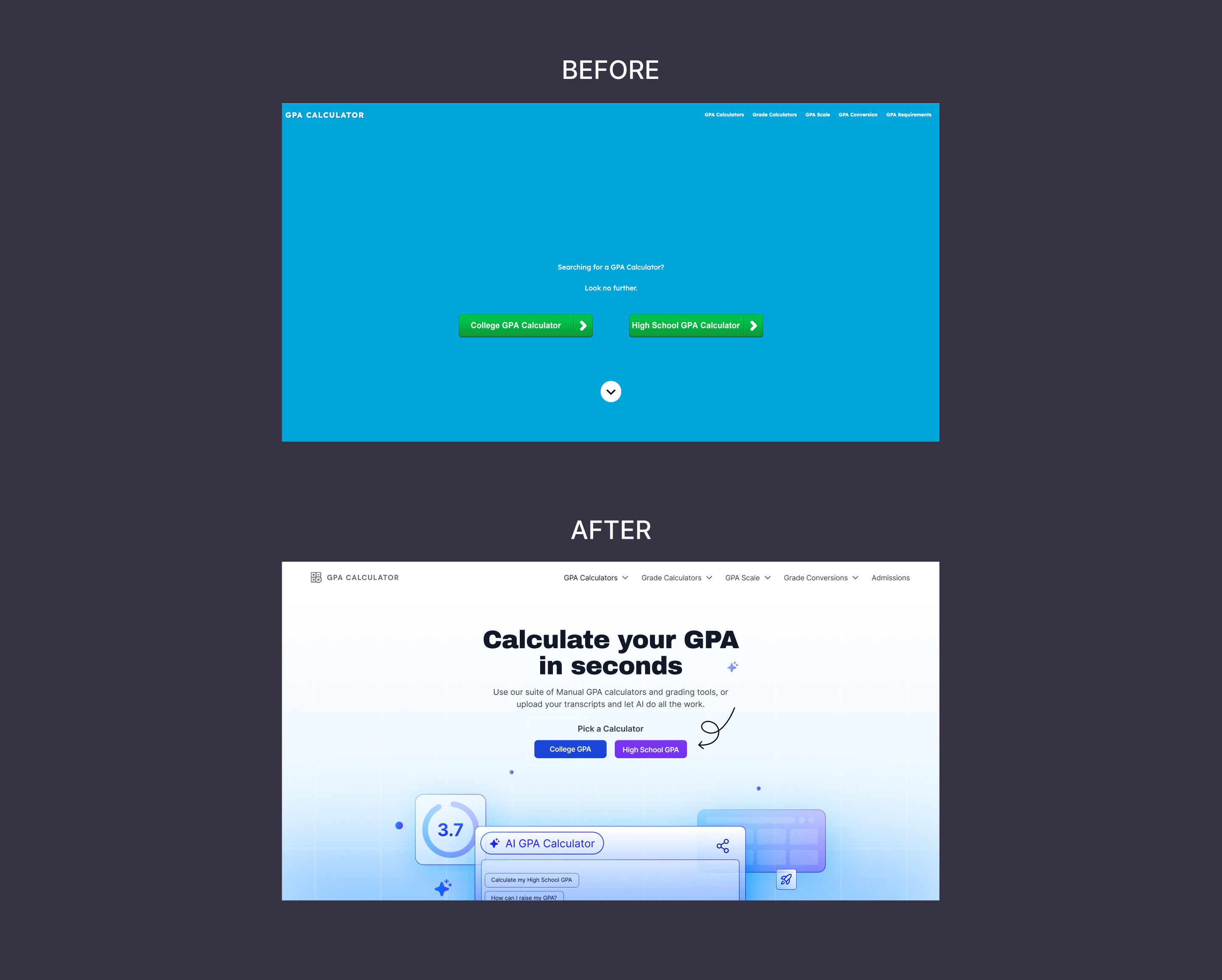
Entry Point | Landing Page Hero
Core Calculators
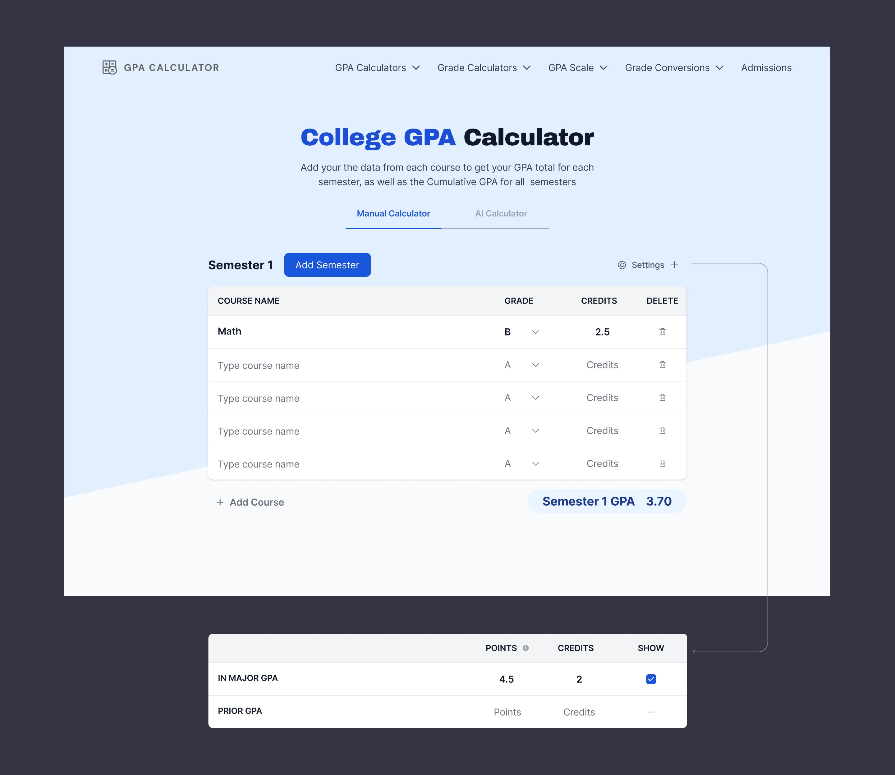
Challenges and new features expected, and the results below:
Issue | Solution |
|---|---|
A straightforward way to add new semesters | Added a primary button with the label label "Add Semester" in proximity to the semester title, before it was below all the courses |
Hidden settings' options | Tertiary level button with added gear and plus icons so the settings could expand on top of the first semester without the need to open and close a modal, like before |
A straightforward way to add new courses and classes | Made sure both the input field in the table and the button to add courses had the same label "courses". Before, the first column was named courses, and the button was labelled as "add classes". Made sure this button was in proximity to the course column. |
College Manual Input
High School GPA Calculator Manual Input
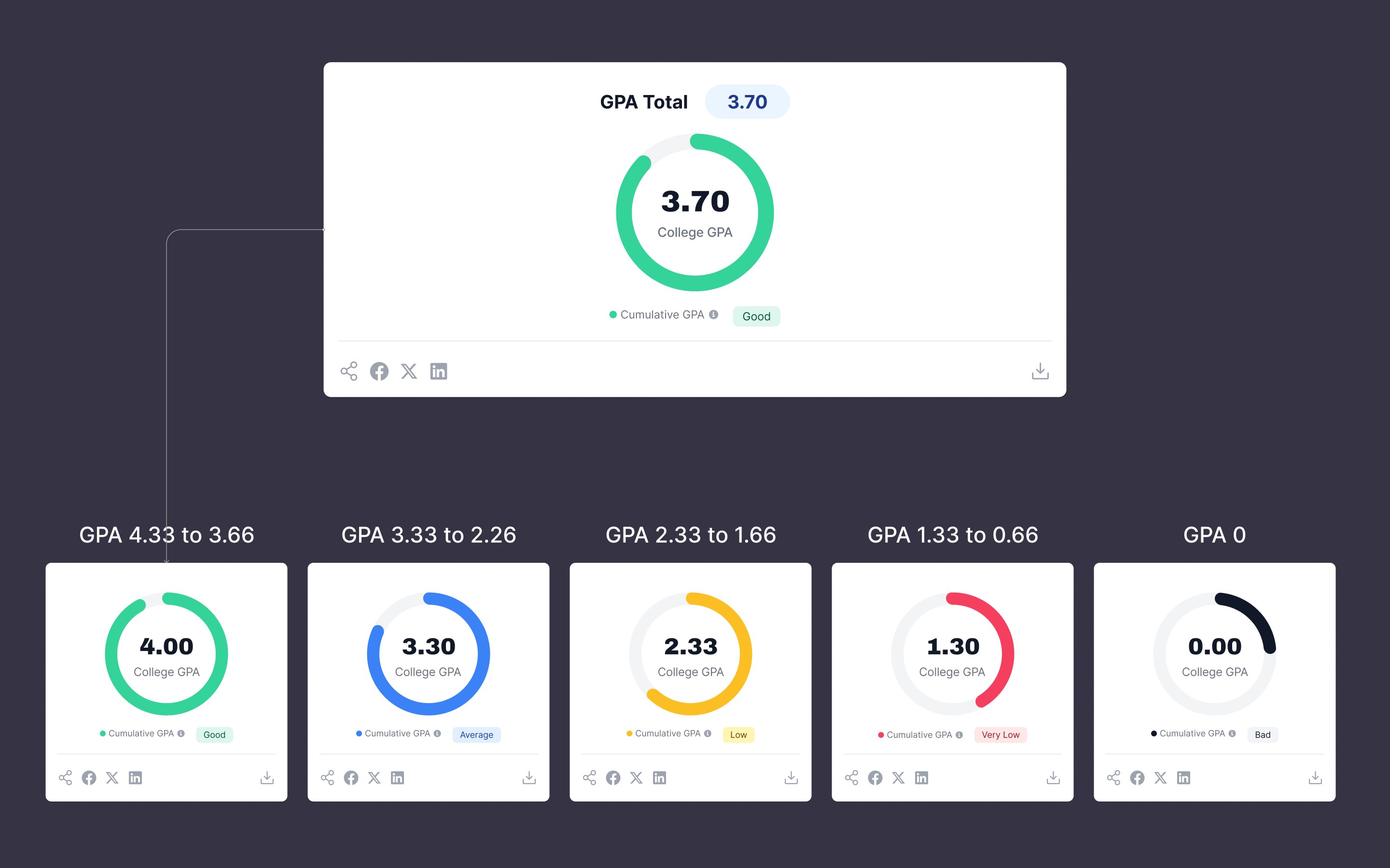
Another feature needed was a quick way to visualize the results quickly. I proposed that this graph would stay at the top, thinking in a mobile-first scenario; however, it ended up at the bottom.
Issue | Solution |
|---|---|
Visualize the GPA score | Created a series of color-coded graphs that should result in a donut chart. I suggested showing this on top, rather than the bottom of the page. But it stood at the bottom. |
A way to share results and download the results | Added share icon buttons to the left and the download icon button to the right in the final chart result, separating both actions |
AI Version
The AI version was a conversational style calculator option, but with pre-defined options. In this case, the functionalities were limited just to the GPS score without settings, as shown below:
Explore the complete Figma File
What I learned and do differently
The first iteration of the product was completed. This was a challenging project that deserved a larger budget to include responsiveness and continuous testing to reach its full potential.
Working as a team of one demonstrated some limitations. I'd particularlyI would've liked to validate the AI version of the calculator since it was the most innovative part of this product, and the one with the least data behind it.
If I could do some things differently, I would've pushed for an MVP prototype and a round of usability testing before the hand-off. Good design without the feedback of actual users is just a good idea.