
Techo NGO: A Story of Lost Connections
Imagine you're a young Argentine, passionate about making a difference for impoverished families. You hear about Techo, an NGO focused on building emergency housing. You sign up to volunteer and get to work. But, after submitting your form, silence follows...You're left wondering…
This was a real-world UXR project completed within a team of five. We did full cohort and individual activities, and delivered a final report, plus a presentation to stakeholders to get certified at Universidad de Belgrano, Argentina.
TIMELINE | 1 ACADEMIC YEAR (32 WEEKS)
ROLE UX RESEARCHER
DELIVERABLES FINAL PRESENTATION AND UXR REPORT
SOFTWARE G-SUITE (SLIDES, SHEETS, DOCS), ZOOM, FIGMA, FIGJAM & MIRO.
My role
Ideation/whiteboard sessions: We met regularly to work on the research, consolidate information, and exchange ideas.
Competitive Analysis: Compared the recruitment processes and volunteering campaigns across various local and non-local NGOs.
Heuristic Evaluation: Audited the existing volunteer sign-up user flow and a volunteer profile quiz.
User Research and Usability Testing: Conducted interviews and remote usability testing for desktop.
Data analysis and insights: Collaborated on the final insights and stakeholder presentation.
The Problem
Post-COVID volunteerism: new priorities, less participation
Techo expressed they were losing connection with young volunteers (17–25). They had already done some research into it and created their report "Plan V" which acted as our brief and framed our first takeaways.
According to the report, three forces were at play:
Shifting post-COVID attitudes toward commitment
A platform too dated and friction-heavy to attract a tech-savvy audience, and
Fragmented volunteer data made follow-up structurally impossible.

What we found
At the end of the academic year, we arrived at actionable insights for our 2 initial research questions, which were finally shared with the stakeholders as a first-person story.
Our research focused on leveraging qualitative data and using both attitudinal and behavioral methods, combined with other tools. In sum, we did a competitive analysis/benchmark of Techo against other 5 NGOs in Argentina and 2 youth volunteering campaigns from the US. We also performed 5 interviews, one heuristic evaluation, and 7 usability tests.
The interviews were especially helpful to identify what volunteers said and experienced, while user testing gave us an overview of how any type of user would interact with the site to sign up. These last 2 methods were the most enlightening to get to our final insights.
Research Plan
PHASE I: UNDERSTAND | PHASE II: EMPATHIZE | PHASE III: DEFINE |
|---|---|---|
|
|
|
This plan structure would help us to:
Understand the problem from different angles
Empathize with the volunteers and people coming to the site, and
Arrive and deliver our insights to offer Techo a pathway to take the next steps
With no metrics and a limited database of volunteers, we leaned into a combination of qualitative research methods to map the problem from every angle as follows:
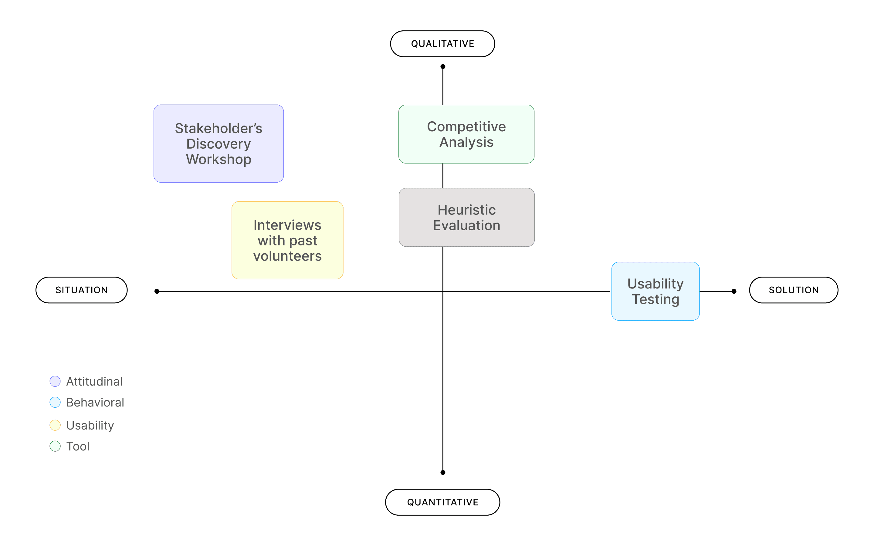
With ample time and no budget constraints, we collected findings at each step of the process.
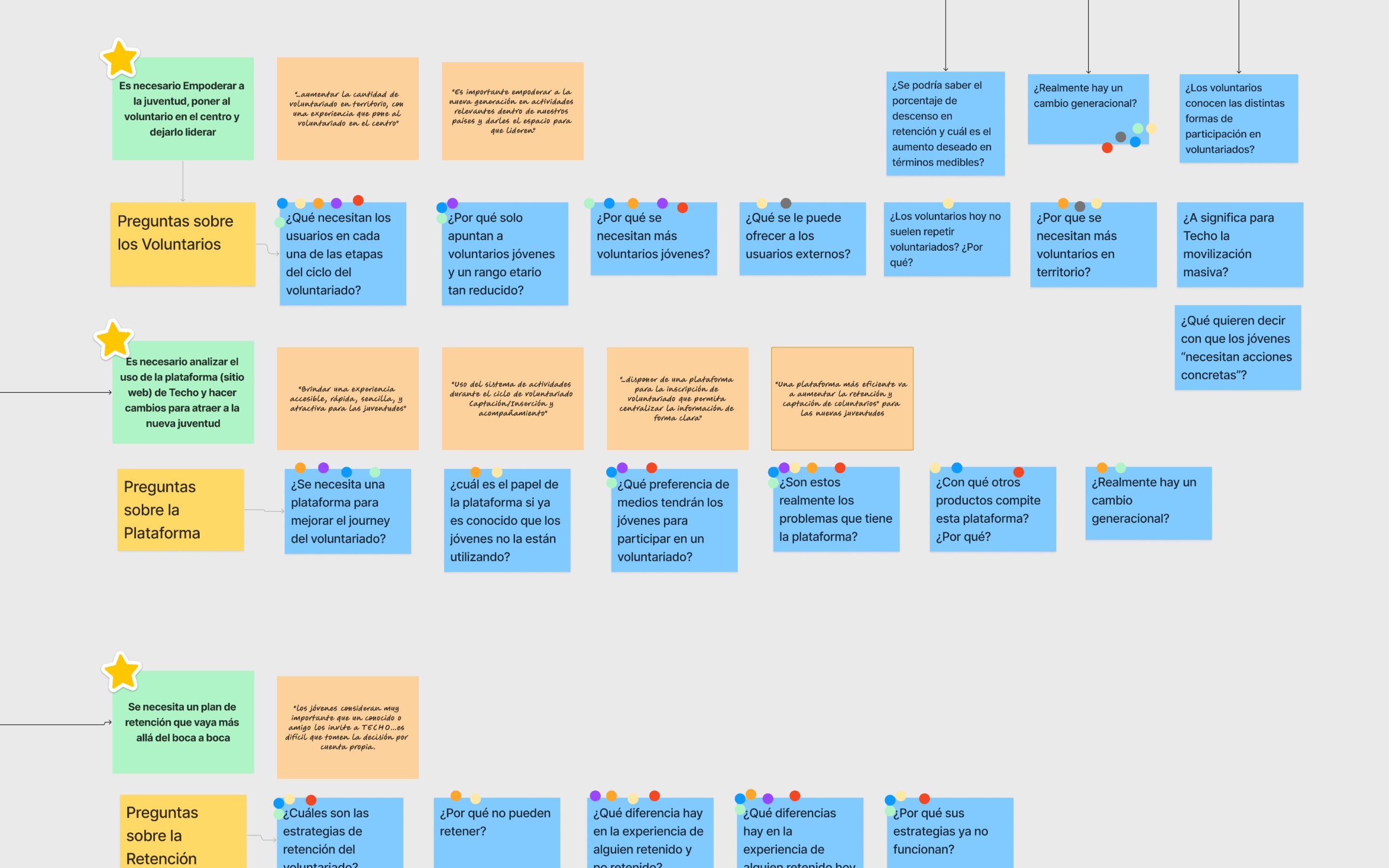
We documented each phase in whiteboard sessions
At the end of each phase, I share its corresponding whiteboard session.
Initial Questions and final Insights
PARTICIPATION | RETENTION |
|---|---|
How can Techo Argentina increase the participation of Young Volunteers between the ages of 17 and 25? | How can Techo retain the participation of current, past, and new volunteers so they keep coming back? |
FINAL INSIGHTS ABOUT PARTICIPATION | FINAL INSIGHTS ABOUT RETENTION |
|---|---|
Be transparent upfront: Let people know the location, the "no-cancellation weather policy", and the costs before they sign up. There is an opportunity to show details and share resources with volunteers regarding meals and lodging conditions as well. Volunteers shouldn't have to hit "submit" just to find out the basic information afterwards. | Open Room for Everyone: Not everyone can (or wants to) do the heavy lifting of building the emergency houses. There is room to create a variety of volunteering opportunities, and to change scheduling and timings for older, or returning volunteers so that their excitement and know-how after the experience isn't lost. |
A Smoother Sign-Up: Make the website easier to navigate, the activities easy to glance at and choose, fix broken links, and reduce steps in the enrollment process so it feels professional and welcoming. | Social Impact Clarity: Be open about the financial side, like what the families contribute and how they are selected. When volunteers understand the full picture, they can feel like true partners in the mission. |
Simplify enrollment: The current pre+registration is 14 clicks away from submission, heuristic issues, and failed user testing proved there is room for improvement by securing basic functionality of the UI and following known patterns. | Caring for the Volunteers: Set realistic expectations regarding the physical intensity and the psychological impact of the activity, while also improving on-site support systems and logistics, could make volunteers feel safer and more valued during the volunteer experience. |
Ok, so how did we get here? Let's rewind
Phase I: Understand
Stakeholders Workshop Findings
The initial workshop reiterated the takeaways from the previous "Plan V" report. The stakeholders still thought they needed a reliable database, and they mentioned repeatedly that the site's visual aspect wasn't geared toward the youth.
This activity was done in different groups from the final ones. We immediately saw some recurring themes: issues were related to the UI, the need for a unified database, the stakeholders' view of the ideal volunteer profile, and finally, how they communicated with volunteers, as seen in the snapshot.

Data Fragmentation: The lack of a centralized database prevents consistent engagement and follow-up.
Targeting Disconnect: Recruitment relies too heavily on word-of-mouth, often attracting "social club" participants rather than the mission-driven 17–25 age group they want.
Visual & Functional Friction: The platform feels dated and unintuitive, failing to attract a tech-savvy audience.
Communication Silence: They admit to a lack of feedback loops, both at sign-up and post-volunteering. This breaks the connection with potential contributors.
Voices from the field
“The current platform is complex and intimidating.”— V. | Techo Stakeholder |
|---|
“I don't know if they're actually interested when they enter the platform/website.”— M. | Techo Stakeholder |
|---|
“The problem lies in response speed and immediacy; solving that would fix the issue.”— V. | Techo Stakeholder |
|---|
At this point, I wanted to know why there was a lack of communication and a follow-up strategy after the volunteering experience.
Benchmark Findings
We focused on the homepage, the volunteer enrollment journey, contact accessibility, gamification, and overall UI/Visual Design, and made a final SWOT analysis to gather some insights. The gist of it is that Techo could benefit from a series of strengths displayed by its competitors, such as:
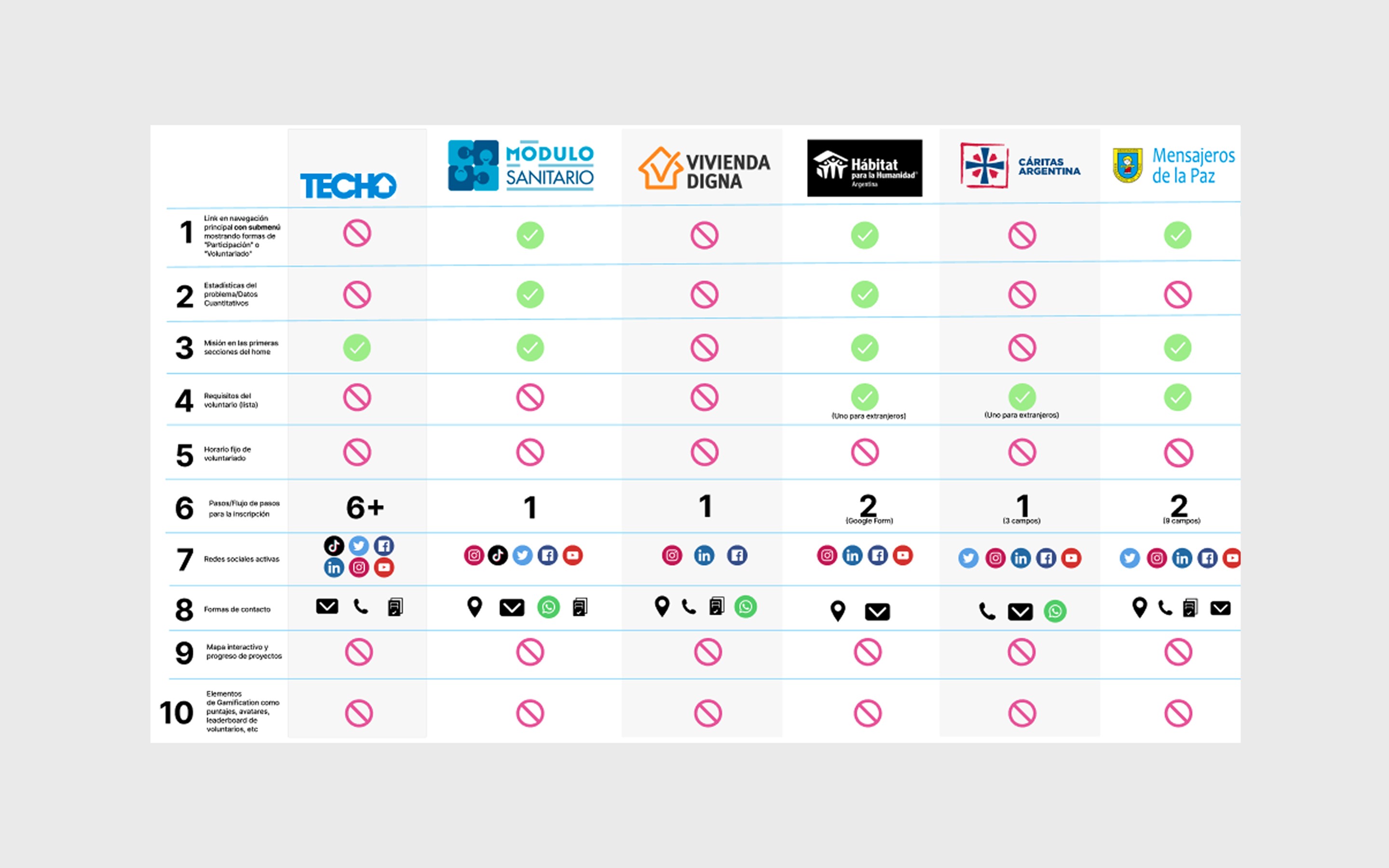
Streamlined Enrollment: The registration journey can be simplified by reducing steps, screen count, and information density.
Volunteer Spotlight: Unlike competitors, there is a missed opportunity for Techo to showcase volunteer stories and provide space for self-expression.
Improved Accessibility: Enhancing the "Volunteer" button findability and integrating direct messaging in Techo's sign-up platform (e.g., WhatsApp) would reduce friction.
Gamification: Youth engagement in the US is driven by gaming elements; a similar approach could increase local traction. We can't know for sure if this kind of engagement would apply to the Argentine youth.
Resource Clarity: There is significant room to improve the depth, detail, and accessibility of resources available to active volunteers, as is done in other NGOs.
Direct messaging: Techo could offer direct access to volunteer leaders through direct messaging, as other NGOs do.
Heuristic Evaluation Findings
29Usability Issues Found | 72%High to low Priority Issues in severity levels 2 to 3 | 17%Urgent issues requiring immediate fix with a severity level of 4 |
|---|
Even though we were not UX experts at the time, we audited the volunteer application form and a self-assessment test on the site against all 10 of Nielsen's heuristics. Most issues were in the low-priority range (severity levels 2 to 3), while a few required immediate attention (level 4).
In layman's words, we found a clunky navigation, broken links that ended up in 404 pages, difficulty exiting and re-entering the same point in the journey. Plus, the need for flexibility, error prevention, and an aesthetic and minimal design that followed UI standards and patterns. I considered them an easy fix.
If I could go back in time, I'd focus on the volunteers' sign-up flow instead. But again, this evaluation proved that the stakeholders were right to point out that there was an issue with Techo's website/platform, but rather than just aesthetics, there were basic functionality elements being dismissed.
Phase II: Empathize
Once finished with the first phase, we started gathering data from the source, the volunteers (for interviews) and the average site user (for usability testing).
Even though Techo has different volunteering activities, our subjects mainly went through the emergency housing build, which is done only on weekends, rain or shine, and it is limited to 2 days max. Volunteers for Techo are recruited in 2 ways: either as groups of students from high schools, or groups of people working in a company. For both groups, participation is optional, but there is an expectation for employees to participate, as they candidly told us.
Knowing this, we focused on recruiting 2 types of profiles for the interviews: Argentines, from both groups, who had done volunteering for Techo more than once (called "Loyals") or just once as workers (called "Business/Corporate"). We hoped that repeating participants could give us insight into the retention issue, so we had a specific set ot questions for this profile. Did we get the exact pool of participants we wanted? No, but we moved forward with what we managed to collect.
Recruiting for usability testing was different. We focused on the average site user, ideally coming to the site for the first time.
Interviews Findings
After designing the screener for recruiting the right users and defining the right questions to ask, we collected all the data, created an affinity map with data from all the volunteers, and journey-mapped the business profile.
We dismissed 2 interviews due to technical problems and data reliability. We finally heard what the volunteers felt, said, and how they recalled the experience, and found out that the experience was different for the business profile and the students/younger participants; the first ones seemed to be less enthusiastic and positive than the latter.
All data was processed in an Affinity Diagram
Here's a snapshot of some of the most striking comments from the participants:
Voices from the field:
“Because I enjoyed it so much (the volunteer experience), I asked the Build Leader if she could save a space for me to continue…every week she sends me a WhatsApp message about upcoming activities.”— M. | Techo Volunteer | Repeating participant | Student (Loyal) Profile |
|---|
Retention only worked when a volunteer took it upon themselves to ask. It wasn't built into the system. Another volunteer expressed her desire to collaborate in a different kind of activity, but never heard back…
“The spark had already been lit in me; don't let it fade. Keep me informed about new activities. As for donating, I was never asked to even collaborate monetarily.”— L.G. | Techo Volunteer | One-time | Business Profile |
|---|
A motivated volunteer, who expressed the experience was life-changing, a "before and after" in her own words, received no follow-up after she asked to volunteer again. A missed opportunity at every level.
“The next day (it rained)(…)women were getting stuck in the mud (…) we all had to push together because if we didn't, it would have been impossible, and that's when you see the reality of the world.”— M. | Techo Volunteer | Repeating | Student (Loyal) Profile |
|---|
The majority of the volunteers expressed how difficult the activity was; one even suggested the activity should be extended to more than two days. Another participant witnessed how others complained about the poor state of the bathrooms, others noticed they didn't have the right tools to build, which made the whole activity much more difficult. In sum, the overall logistics weren't ideal.
Not only was it difficult to build the houses, but also, the volunteers mentioned seeing a reality they hadn't experienced before, and that it proved to be harsh as well. Some volunteers witnessed gender and other types of violence amongst the families during the activities. Something they weren't used to.
On the bright side, most of them mentioned making life-time bonds and remembering the families and co-participants with fondness. A couple mentioned it was a life-changing experience.
Usability Test Findings
We performed task-based remote usability tests and focused on the Desktop version of the site due to budget constraints and the lack of technical equipment.
Participants had to complete 6 tasks:
Find Techos' site
Find the catalog/page of volunteer activities
Choosing a specific activity in a specific location (house-build in Salta)
Go through the pre-registering process for in 1 volunteer activity, and
Checking if the confirmation email was received. We also had a series of exploratory questions to guide the process.
We found very positive results; however, some participants had a lot of guidance, which means these results could have been skewed.
22Total issues found, mostly concentrated in 2 tasks: firstly, when trying to find the specific volunteering experience, and secondly, when trying to complete the registration process. | 6/6 ParticipantsAll participants completed tasks 1, 2, 3, and 5 successfully. Task 4, which was completing the pre-registration flow, was the most complex and required going through 14 screens. | 5/6 ParticipantsCompleted task 4 (pre-registration flow). However, at least 3 were guided into finding the submit button at the end of the flow. |
|---|
We found a few issues:
Difficulty using the activities filters (functionality issues)
Not enough clarity in some of the wording
Not enough clarity and transparency about the logistics of the activity (lodging, pricing, and the medical certificate requirement).
50% of participants didn't find the submit button to get the email
A couple of participants couldn't complete the process in less than 6 minutes. The timing of these tests was disregarded as a success metric because some participants were asked questions during the process and paused to answer them.
Final Insights
We ended up with a data wall in another FigJam file that made triangulating data points much easier to get to the final insights revealed at the beginning of this case study. The data wall acted as our source of truth to reach our conclusions and present to stakeholders.
By triangulating findings across 5 research methos and multiple artifacts to analyze the data, a story started to emerge. It was evident that the problems of participation and retention weren't isolated, but connected to a whole service experience that combined the hardship of the physical experience, the mishaps of the digital experience, and an inconsistent communication that ended with a loss of connection.
What I learned and do differently
This project taught me that the most important UX problems go beyond the digital product. Joining Techo's volunteer experience was relatively easy on the website, as our participants demonstrated, but living the experience and feeling encouraged to repeat it was a completely different challenge.
My hunch is that retention had deeper roots: the narrow age-range of participants, the fact that building a housing solution in a limited timeframe is very difficult at any stage of life, and the hardship endured by the volunteers during the process. These are some angles that I'd focused on, given the opportunity.
If I were to continue, I'd push toward a service design lens, mapping not just the volunteer's digital journey, but finding ways to improve the on-field activity logistics and the support offered to volunteers.
I'd also prioritize mobile usability testing, since our tests were desktop-only, and the 17–25 demographic probably leans more to mobile navigation. Participants would have to be in the same age range as what Techo wants, so the tests can give us the most accurate data.
What I'm most proud of is the triangulation: by combining our findings from the stakeholder workshop, competitive analysis, user interviews, heuristics, and usability testing, we built a strong case to guide Techo's next steps moving forward.